Guys, we put our soul into the site. Thank you for
that you discover this beauty. Thanks for the inspiration and goosebumps.
Join us at Facebook and In contact with
Scheme No. 1. Complementary combination
Complementary, or complementary, contrasting are colors that are located on opposite sides of Itten's color wheel. Their combination looks very lively and energetic, especially at maximum color saturation.
Scheme number 2. Triad - a combination of 3 colors
A combination of 3 colors lying at the same distance from each other. Provides high contrast while maintaining harmony. This composition looks quite lively even when using pale and unsaturated colors.
Scheme No. 3. A similar combination
A combination of 2 to 5 colors located next to each other on a color wheel (ideally, 2-3 colors). Impression: calm, relaxing. An example of a combination of similar muted colors: yellow-orange, yellow, yellow-green, green, blue-green.
Scheme No. 4. Separately complementary combination
A variant of a complementary combination of colors, only the colors adjacent to it are used instead of the opposite color. The combination of the primary color and two additional. This circuit looks almost as contrasting, but not so intense. If you are not sure that you can correctly use complementary combinations, use separately complementary ones.
Scheme number 5. Tetrada - a combination of 4 colors
A color scheme where one color is the primary, two are complementary, and another emphasizes. Example: blue-green, blue-violet, red-orange, yellow-orange.
Scheme number 6. Square
Combinations of individual colors
- White: goes with everything. The best combination with blue, red and black.
- Beige: with blue, brown, emerald, black, red, white.
- Gray: with fuchsia, red, purple, pink, blue.
- Pink: with brown, white, mint green, olive, gray, turquoise, pale blue.
- Fuchsia (dark pink): with gray, tan, lime, mint, brown.
- Red: with yellow, white, brown, green, blue and black.
- Tomato red: blue, mint green, sandy, creamy white, gray.
- Cherry red: azure, gray, light orange, sand, pale yellow, beige.
- Raspberry red: white, black, the color of a damask rose.
- Brown: bright blue, cream, pink, fawn, green, beige.
- Light brown: pale yellow, cream white, blue, green, purple, red.
- Dark brown: lemon yellow, blue, mint green, purple pink, lime color.
- Reddish brown: pink, dark brown, blue, green, purple.
- Orange: cyan, blue, lilac, violet, white, black.
- Light orange: gray, brown, olive.
- Dark orange: pale yellow, olive, brown, cherry.
- Yellow: blue, purple, light blue, purple, gray, black.
- Lemon yellow: cherry red, brown, blue, gray.
- Pale yellow: fuchsia, gray, brown, shades of red, tan, blue, purple.
- Golden yellow: gray, brown, azure, red, black.
- Olive: orange, light brown, brown.
- Green: golden brown, orange, green, yellow, brown, gray, cream, black, creamy white.
- Light green: brown, tawny, fawn, gray, navy blue, red, gray.
- Turquoise: fuchsia, cherry red, yellow, brown, cream, dark purple.
- An electrician is beautiful in combination with golden yellow, brown, light brown, gray or silver.
- Blue: red, gray, brown, orange, pink, white, yellow.
- Dark blue: light purple, blue, yellowish green, brown, gray, pale yellow, orange, green, red, white.
- Purple: orange, pink, dark purple, olive, gray, yellow, white.
- Dark violet: golden brown, pale yellow, gray, turquoise, mint green, light orange.
- Black is universal, elegant, looks in all combinations, best with orange, pink, lettuce, white, red, lilac or yellow.
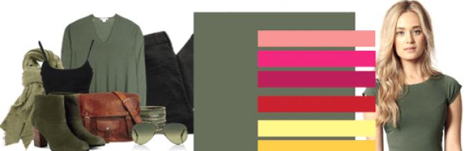
Choosing colors that combine favorably with green is pretty simple. After all, nature itself prompts them to us. Green is the color of tree crowns, grass carpet and crunchy ripe apples. Many people associate it with youth, freshness, hope and calmness. To correctly and effectively add it to your wardrobe, you need to know what colors are combined with green.
A very bright and fresh image is obtained in which green and white are combined. It can be a green dress with white accessories or vice versa, white - with green, a strict white suit with a green handbag, belt, shoes and a neckerchief, a heavily green coat, complemented by a white beret and handbag, etc. By the way, this combination can also be noted for men.

In summer, the whole world around us tells us a combination of green and yellow. True, in this case, you should still choose more muted shades of both colors, so as not to become like a clown. So, for example, a dirty yellow belt or the same shade of the shoe is perfect for olive trousers.
What colors are combined with green, photos of perfect combinations

The newfangled combination is green and purple. It is these paints that modern mods choose this season. By the way, in this case, both colors can be very bright. Thanks to such a seemingly strict combination, any image, even business one, can be made more stylish, effective and harmonious. True, it is best if the advantage in this case is on the green side.
As for black and green, this is a universal combination. It is suitable even for a festive or evening look. So, for example, a green dress on the floor is perfectly complemented by black shoes, the same color belt, bag and various miniature jewelry. Yes, and for everyday onions, the combination of black with green will be very useful. At the same time, any color can have a quantitative advantage in this combination. In both cases, the image will look harmonious.

In general, it is important for every fashionista to know what colors are combined with green. Moreover, there are a huge number of such combinations.
You can complement the green outfit with even bright red accessories. Only in this case it is important to remember that there should be several times less red in the image than green. For example, one small detail.
And, to find your own most effective and profitable combinations, do not be afraid to experiment.

Articles on the combination of green in clothes
Green color, combinations
Green + white


Green + yellow


Green + purple


The combination of blue is a contrasting combination with warm and light shades, but each shade of blue needs its own spectrum tones.
Blue color can be divided into its main shades: bright blue or blue-blue, blue-violet (royal blue), blue-green, gray-blue. We will consider dark blue separately.
These shades can be divided by color types: so blue-blue is suitable for the spring color type; blue-violet - “winter”, gray-blue - “fly”, and blue-green - “autumn”. However, in terms of contrast, blue-blue and blue-violet will suit both “spring” and “winter”, and gray-blue and blue-green will suit “fly” and “autumn”.
The article presents 44 patterns of combinations of shades of blue with all possible variety of tones. Each palette includes supporting neutral colors that enhance contrast, as well as adjust the degree of brightness of the combination.
Combinations with blue color:
The combination with blue is mostly contrasting. Firstly, it is the coldest shade of the entire color palette. Warm colors against the background of it will look more juicy. Secondly, blue is a dark color, and light tones will stand out next to it.
Related shades, such as blue, cool green, create wonderful gradients, which can also become a background for warm tones.
Blue + Pink, Coral
The combination of pink and blue depends on the brightness of pink: so soft pink next to the main color gives softness to the combination, and derivatives of fuchsia - impudence. Warm tones of pink, such as coral, pink-peach, sunset - create a bright thermal contrast.


Blue-blue is combined with pink:
white-purple, medium pink, color Barbie, raspberry, purple-pink. Basic colors: creamy white, light gray, wet asphalt.
Blue-violet is combined with pink:
royal pink, pink-peach, bright coral, magenta, fuchsia. Basic: light cream, old wood, black and gray.
Blue-green is combined with pink:
white-lilac, krivetkov, sunset, amaranth, purple-violet. Base: milk, gray-purple, wet asphalt.
Gray blue is combined with pink:
the color of pink cotton, pink-peach, coral, fuchsia, raspberry. Neutral: pale cream, gray-beige, black-gray.
Blue + red, burgundy
The combination of red and blue is very strong, but it always needs the support of third-party shades, for example, white, beige and / or black. Blue and red are the color contrast of the fundamental tones, however, they are very close to the light scale, therefore, in combination, the most expressive light contrast is lacking.


Blue-blue is combined with red:
scarlet, Chinese red, dark red, cherry, maroon. Neutral: cream white, medium peach beige, black gray
Blue-violet is combined with red:
light red, raspberry coral, dark red, bright burgundy, wine. Basic colors: light cream, light orange-beige, black-gray.
Blue-green is combined with red:
the color of Marsala, watermelon, red chicory, ruby-burgundy, wine. Basis: milk, gray-beige, black-gray
Gray blue is combined with red:
pomegranate, red rose, burgundy, burgundy, wine. Base: pale cream, medium yellow-beige, black-gray.
Blue + Orange, Peach
The combination of orange and blue is pronounced, as this is a combination of additional shades. The most promising for the main color will be soft tones of orange: peach, mango, orange-coral. They, as less pronounced, make the combination harmonious, adding expressiveness from the difference in lightness.


Blue-blue is combined with orange:
peach, mango, orange, carrot, dark orange. Basic colors: creamy white, steel, wet asphalt.
Blue-violet is combined with orange:
light peach, orange-coral, pumpkin, red-orange, red. Neutral: light cream, gray beige, wet asphalt.
Blue-green is combined with orange:
yellow-coral, caramel, sienna, brick, red. Base: milk, gray-purple, wet asphalt.
Gray blue is combined with orange:
peach, orange-coral, fiery, dark orange, red. Basis: pale cream, greenish-gray, wet asphalt.
Blue + Yellow, Gold
The combination of yellow and blue is the climax of thermal contrast. If you combine the medium-dark shades of blue with the warm tones of yellow (we discard the saturated lemon, canary), which have a small admixture of red, then this combination will be catchy, but not flashy. Gold also gives the blue expensive gloss.


Blue-blue is combined with yellow:
cream, sunny yellow, banana, corn, bright gold. Neutral: creamy white, mid-peach-beige, anthracite
Blue-violet is combined with yellow:
apricot, saffron, signal, mustard, bright gold. Base: light cream, dark beige, wet asphalt
Blue-green is combined with yellow:
gray-yellow, honey, hazel, pale gold, dark gold. Basis: milk, gray-beige, wet asphalt
Gray blue is combined with yellow:
apricot, corn, yellow-orange, bright gold, golden oak. Basic colors: pale cream, medium orange-beige, wet asphalt.
Blue + warm green
The combination of blue and green in warm colors is a moderate thermal contrast, which makes the combination play so that the gaze lingers slightly and continues to slide. The combination promotes relaxation and tranquility.


Blue-blue is combined with warm green:
pistachio, chartreuse, green apple, bright green, herbs. Base: creamy white, light beige, anthracite.
Blue-violet is combined with warm green:
light green, light green, yellow-green, the color of a favorite toad, dark green. Base: light cream, medium beige and beige, wet asphalt.
Blue-green is combined with warm green:
pale green, olive green, a frog in a swoon, the color of needles, brown-green. Neutral: milky, medium-neutral-beige, wet asphalt.
Gray blue is combined with warm green:
light green, yellow-green, green apple, toad in love, dark green. Basic colors: pale cream, medium orange-beige, wet asphalt.
Blue + cool green
The combination of blue and green in cold colors is an overflow of related shades. The eye completes the intermediate tones, thereby making a combination of iridescent and voluminous. Such a gamut is good for the background: you can always bring warm colors to the foreground.


Blue-blue is combined with cold green:
neon green, mint, jade, emerald, malachite. Neutral: cream white, steel, wet asphalt
Blue-violet is combined with cold green:
water color, neon green, jade, emerald green, malachite. Base: light cream, greenish gray, black gray
Blue-green is combined with cold green:
the color of water, gray-blue-green, pale menthol, emerald, dark cold green. Basis: milk, greenish-gray, wet asphalt
Gray blue is combined with cold green:
the color of water, menthol, mint, emerald, dark cold green. Basic colors: pale cream, silver, wet asphalt.
Blue + Blue, Cyan
As well as dark blue tones - this is a work with contrast. Lighter or darker tones of blue create a feeling of light shade, which gives volume: deepens, makes it alive. This combination is a good background for more expressive couples.


Blue-blue is combined with blue:
bright blue, topaz, mid blue, navy blue, black and blue. Basic colors: creamy white, steel, wet asphalt.
Blue-violet is combined with blue:
aquamarine, pale blue, cyan, cornflower blue, indigo. Neutral: light cream, platinum.
Blue-green is combined with blue:
aquamarine, gray-blue, hyacinth, the color of the black sea, thunder. Basis: milky, light gray, wet asphalt.
Gray blue is combined with blue:
water color, bright blue, dark blue, Prussian blue, dark blue. Base: pale cream, greenish gray, wet asphalt.
Blue + Purple, Purple, Lilac
The combination of blue and violet is essentially a combination of related shades, but since there is an admixture of red in violet, a slight thermal contrast will also come through. This combination is complete, although colors such as white, beige and black will add expressiveness to it.


Blue-blue is combined with purple:
blue-violet, thistle, blackberry, purple, red-violet. Basis: cream-white, medium brown-beige, wet asphalt
Blue-violet is combined with violet:
pale thistle, cyclamen, lilac, purple, grape. Base: light cream, medium yellow beige, black and gray.
Blue-green is combined with purple:
pale lilac, lilac-lilac, amethyst-lilac, brown-violet, red-violet. Basic colors: milky, medium-neutral-beige, wet asphalt.
Gray blue is combined with purple:
blue-violet, violet, thistle, purple, eggplant. Neutral: soft cream, medium orange-beige, wet asphalt.
Blue + brown
The combination of blue and brown is one of the most attractive. Sophisticated brown tones give the main color an intricate sophistication. Like practicality and sublimity, these tones form a mutually beneficial tandem. In addition, brown can be considered a derivative of orange, which is complementary to blue.


camel, golden chestnut, red-brown, mahogany, coffee. Base: cream-white, medium brown-beige, black-gray.
camel, cinnamon, light chestnut, chocolate, coffee. Base: light cream, medium orange-beige, black-gray.
color of cocoa with milk, hazelnut, milk chocolate, brown-violet, dark chocolate. Neutral: milky, medium purple-beige, wet asphalt.
the color of oak, tan, golden chestnut, chocolate, coffee. Basic colors: pale cream, dark peach-beige, black-gray.
Blue + beige
The combination of blue and beige is soft, solid, expressive. Beige is very light brown when it is in turn clouded with orange. Therefore, the influence of an additional shade is observed in this combination.
A beige tone, no matter in which combination it is, adds a restrained expensive gloss, so even the bright blue tones next to it lose their childish simplicity.


Blue-blue is combined with brown:
light yellow-beige, light orange-beige, medium peach-beige, dark brown-beige, dark pink-beige. Base: creamy white, light gray, anthracite.
Blue-violet is combined with brown:
light peach-beige, light orange-beige, medium-orange-beige, dark peach-beige, dark green-beige. Neutral: light cream, platinum, wet asphalt.
Blue-green is combined with brown:
light purple beige, light neutral beige, medium gray beige, dark gray beige, dark brown beige. Basic colors: milky, silver and dark gray.
Gray-blue is combined with brown:
light yellow-beige, light orange-beige, medium peach-beige, dark peach-beige, dark orange-beige. Basis: pale cream, greenish-gray, wet asphalt.
Blue + Gray, Silver
The combination of gray and blue is one of the best ways to emphasize the beauty and versatility of a blue hue. Gray as a cold neutral color is almost completely lost to the eye next to blue, giving it a natural cold, restraint and depth.


Blue-blue is combined with brown:
white-gray, light gray, silver, marengo, anthracite. Neutral: creamy white, medium peach beige.
Blue-violet is combined with brown:
white-gray, silver, platinum, lead, dark gray. Base: light cream, light pink-beige, wet asphalt.
Blue-green is combined with brown:
USEFUL ARTICLES ON THIS TOPIC (click on the picture)
Before proceeding directly to color combinations, some rules need to be noted.
1. One color looks great next to its shades (for example, blue with blue, purple with lilac).
2. Bright colors should not be combined with each other. Less vivid combinations should be selected for a bright color to avoid disharmony (for example, use bright red with pale yellow, bright green with dark brown). Dark colors with each other will also not be able to create a stylish composition. Try so that one color can even interrupt a little.
3. There are some colors and their shades that should not be used together at all: blue with green, red with green and purple, purple with burgundy and blue, orange with yellow.
4. Well, the last rule: combine cold colors with each other, their shades (blue and pink, for example).
Now we turn directly to the combination of colors and their shades. Sorry in advance that not all possible compositions will be disassembled. Thus, I hasten to provide readers with the right to authorship in this topic.
Let's start with white: it combines with any colors. But his “opponent” - black - oddly enough, not every color will fit. For example, black with blue will not be able to produce the desired positive effect. It is worth considering special requirements: use black with red, with pink, with yellow, with orange, with lilac, with light green (I think you will guess what color we are talking about).
The beige color, like white, will create a composition pleasing to the eye with almost any shade of purple, blue, green, yellow, and brown. Separately, it would be worth highlighting the most suitable: raspberry, peach, gold, lilac, silver. With beige, you can easily hide flaws.
I can not help but draw your attention to the lineup, consisting of blue, pink, gray, lilac. Their order of listing is not accidental: blue to lilac is not particularly suitable, as well as gray to blue, but blue will look great with pink, and gray with lilac. With a blue and lilac tone, they can create a good composition with yellow and orange, with gray - peach and turquoise.
Now let's go straight through the rainbow. Let's start with red. Do not forget that this color is quite daring (especially bright). It does not fit all colors. Among the most successful combinations should be noted black, blue, yellow. For example, a shade of red - burgundy - would look good with gray and beige, and brown - with yellow, with blue.
I would also like to mention the so-called leopard coloring. Black, white, red, brown, blue, violet look good with it.
But back to the rainbow. Among the most successful compositions with orange, it is worth highlighting purple, blue and green tones.
Next, we dwell on the preferences used with yellow: it is black, purple, blue, green, red. Light colors really suit many vibrant colors. But in this case, avoid the following combinations with yellow: pink, blue, lilac and gray shades.
We pass to the next step of the rainbow - to green. With this color, use brown, orange, yellow, lime.
About blue we have already mentioned - we will not repeat. It’s better to consider the border between green and blue ... for example, turquoise, so common lately. It will suit, respectively, not only blue and green, but also brown, and bronze, and orange, and yellow, and purple.
Now take a closer look at the blue color. It is perfect for blue (as to its own shade), and gray, and red, and yellow.
With violet, the best combinations will form such colors as pink, orange and yellow.
I wish you successful color combinations and a pleasant pastime in the process of their selection!
The combination of blue in clothes is fascinating and attracts attention. This color is noble and luxurious. I want to drown in it, drink it to the bottom, dissolve in a deep blue. Blue is universal and democratic, airy and saturated. It is the color of the sky, the ocean, the mysterious lagoon, the dark sea ... It looks great on noble materials such as silk, velvet, satin. It’s impossible to watch enough. Perhaps that is why the things in blue in the wardrobe are always the most favorite.


Features and Benefits
In the entire color palette, blue is the most controversial and mysterious. The peculiarity is that it has many shades of various saturation. They can cause interesting associations. Blue is a natural color. Its contrast makes any image unforgettable and original. This color creates a special mood.


The advantage of the blue palette is that even simple everyday wear gives it a solemnity and status. Blue is a universal shade. It fits perfectly into the wardrobe of men and women. Stylists recommend using blue at any time of the year. He looks beautiful on shoes, jewelry, bags.


Successful combinations are easy to match with blue, but remember that it does not harmonize with bright red. This combination is annoying and awakens aggressiveness due to high contrast. It is best to wear blue clothes with red accessories, not clothes. Do not combine blue with pink, purple.
Remember that the blue color carries severity, detachment, restraint. At the same time, it is dynamic and light.


What does it mean
Blue color brings good luck, it means eternity, symbolizes the sky, lightness and airiness. Deep blue and royal - the color of honesty, chastity, kindness, good glory, fidelity. He is able to calm the nervous system, eliminate poor health and distraction. Blue color is associated with stability, peace, reflection. It drowns out passion and contains some kind of secret.


Those who love blue have special features: melancholy, slight insecurity, modesty, honesty. Such people prefer peace, love solitude, avoid noisy companies. At the same time, blue is the color of luxury, grandeur, wealth, tranquility, generosity, rebellion.

To whom it goes
The blue color is deep, cold and contrasting. It perfectly suits girls of the “winter” and “summer” color types - brunettes and brown-haired women. In this case, choose calm dark blue shades: royal blue, sapphire, navy. Girls with a cold winter color can use ink colors, sea waves, and sky blue. You should also pay attention to neon blue: electric, indigo and cornflower blue.

Girls "summer" is better to choose soft and light shades of blue. Aquamarine, forget-me-not color, blue. The “autumn” and “spring” color types are ideal for a warm shade of blue - turquoise. Pay attention to the color of the sea wave, dark blue. The remaining shades can also be used, but it is desirable that the blue color is not close to the face, but is in the background.

The combination of blue with other colors
Blue is one of the most popular colors in the fashionista’s wardrobe. It combines perfectly with opposing shades. With clothes of blue color, it is easy to create diverse bows, avoiding uniformity.
- Burgundy. Attractive and tasty ripe cherry color that is hard to resist. The combination of burgundy and blue is based on contrast. Passion and energy are mixed with calm and balance. If you combine burgundy color with dark shades of blue you get a restrained and noble image. Bright blue and burgundy will look spectacular and stylish.

- Brown. Harmonious, calm and creative combination. Brown and blue have one beginning. They are natural, natural colors that cause association with earth and sky. The most beautiful combination will turn out if you combine ultramarine and brown in one set. Sapphire blends perfectly with a light brown color. Stylists advise combining light blue with dark brown and vice versa.

- Green. A wonderful natural combination. The color of greenery and a deep lake inspires many designers and stylists to create original images. It looks interesting dark blue color with various shades of green. In this case, navy does not seem so gloomy and cold.

- Violet. A successful combination of blue and purple creates a sense of harmony and tranquility. Stylists advise combining these two shades in dark colors. The perfect combination is dark purple, cornflower blue or deep blue.

- Yellow. The combination of yellow and blue gives a summer mood. These are shades of the sun and the sea, so they look best on flowing and thin fabrics. A great office option will work if you put on a lemon-colored blouse and trousers or a skirt in a dark cornflower blue hue. The combination of yellow and blue looks great in everyday fashion. It refreshes and rejuvenates.

- Silver. Silver color in perfect harmony with contrasting colors. Blue successfully combines with it, it looks solemn and luxurious. Stylists advise matching silver shoes or other accessories to a blue dress or skirt.

- Purple. A good combination of related colors. They complement each other and help create a beautiful and harmonious image. Want to add more vibrant notes to your outfit? Use purple and pink accessories, as well as white, black and beige accessories.

- Orange. Stylish and bright combination. An outfit with these shades looks elegant and romantic. Most often, orange and blue are found in summer sets. This harmonious combination can also be used in the fall. A blue coat and orange boots will make life brighter and cheer up!

- Beige. A gentle and elegant combination will turn out if you combine beige, turquoise and electric in one set. Beige is a neutral color and against its background many colors become a strong accent. Blue is perfectly combined with it.

- Gray. In one image, blue and gray look ambiguous. On the one hand, this combination refreshes the image, on the other hand, makes it boring. Stylists advise choosing the right shades of these colors. It is best to stay in gray with a bluish tone, and choose blue brighter. Use white or beige accessories in the look.


- Mustard. This color is associated with bitterness, spicy seasoning, so you should not joke with it. Blue and mustard are a good combination that can grow into a great friendship. Stylists recommend choosing dark shades of blue, then the image turns out luxurious, soft and sophisticated.

Blue blends perfectly with classic white and black. In the first case, you get an easy summer option, in the second - a slightly weighted, business image. Combining black and blue, choose bright colors. The ideal option is ultramarine.


Fashion trends
This season, the blue color in clothing is gaining popularity and is strengthening its position. He is among the ten most fashionable colors of the warm season. Designers offer fashionistas to pay attention to dark blue and transparent blue. The main color of the 2017 season is Niagara. This is a classic denim shade - simple, comfortable and serene. Niagara is universal. It perfectly combines with pastel, bright, contrasting shades, creates a balance in the image.


In most fashion collections, designers offer to pay attention to the deep and rich blue color - lapis lazuli. It symbolizes the bottom of the ocean. Intense and deep. It goes well with yellow. At the height of fashion, seawater clothing illuminating azure and translucent blue. This color scheme looks great on summer dresses made of thin fabrics, coats, loose-fit jumpers. Stylists advise combining it with pale pink and neutral beige.

How to wear blue
Blue color is multifaceted. It combines two opposite tones - pale blue, turquoise and heavy dark blue. Blue shades are associated with reverie, lightness, lightness, summer sky, and dark with serenity and balance. Remember that blue, regardless of its shades, can complete any look and complement the wardrobe. Light blue tones should be combined with a contrasting dark blue, red, orange, brown.

Delicate blue color looks original with gold, gray, olive. It is not recommended to combine blue with green and pink. Accessories in electric color will adorn a golden dress or tan pants. Jeans or a dark blue skirt are well combined with an olive blouse, a red scarf, silver jewelry or accessories.
To create a festive evening look, stylists recommend choosing deep blue tones - a shade of twilight, ink. Keep in mind that a deep dark color will add along with rigor and visually add age. For a party, informal events, it is best to choose bright blue colors - indigo and electric.

Shades in men's fashion
Blue color is impeccable. It attracts attention and is considered a good alternative to black. In men's fashion, there is blue, but in more restrained shades. The most popular colors that go to men are metallic blue, navy blue, deep, sapphire, ultramarine. Dark blue tint - attractive. It can be used to create an office, business image.


Instead of a classic black suit, stylists recommend wearing a dark blue version. The blue metallic hue is complex and ambiguous. If you want to create a stylish look, approach the process carefully. Everything should be impeccable. A suit of this shade is a luxurious option. It looks great at a gala event or official party.


Sapphire-colored clothing is beautiful and rich. The color adorns any outfit, but does not make it heavier, it looks expensive and noble. Ultramarine is a bright blue tint compared to others. It is a luxurious and expensive color. An interesting and stylish look is obtained by wearing an ultramarine jacket, a white shirt, jeans, and suede shoes in a dark blue hue.


How to choose jewelry
When choosing jewelry should take into account many different factors, such as the style of clothing, the shade of blue and the type of girl. The classic blue dress is in harmony with massive jewelry and jewelry. They will make the image spectacular. If a dress, blouse or skirt has ruffles, shuttlecocks, inserts, assemblies, it is not recommended to overload the image with additional accessories.


Things in blue are in perfect harmony with silver and white gold jewelry. Choose quality jewelry. A blue blouse with a yellow or massive necklace will look great. It goes well with blue jewelry in gold, red, orange. Natural shades - green, blue and green refresh the image and are in perfect harmony with the blue color.


When choosing jewelry, consider the features of appearance. Fragile, thin girls should not choose too massive necklaces and bracelets. This will look appropriate and advantageous if, in addition to the voluminous necklace, it will no longer be in the form of large accessories. Full girls should also adhere to this rule: massive jewelry weight the image in large numbers, so it is better to stay on long massive earrings.